Category Slider Widget
for Magento
User Guide
Version 2.2.0Build flexible, card-style subcategory grids with images, descriptions, and custom ordering — without hand-coding blocks every time.
Live Demo: https://hyva.jscriptz.com
1. Installation
For complete installation instructions, please refer to the separate Jscriptz Subcats Installation Guide, which covers:
- System requirements
- Installation via Adobe Commerce Marketplace
- Installation via Composer (CLI)
- Verification steps
- Uninstallation and upgrade instructions
2. Global Configuration
After installation, configure the global Subcats behavior. These settings serve as defaults that can be overridden at the category or widget level.
2.1 General Settings
The General Settings section controls the core module behavior.
| Setting | Description | Options |
|---|---|---|
| Enabled | Enable or disable Jscriptz Subcats globally | Yes / No |
| Open Links In New | How subcategory card links open when clicked | Same Window / New Tab |
| Hide Empty Categories New | Hide subcategory cards that contain no products | Yes / No |
| Show Product Count New | Display product count badge on each card | Yes / No |
2.2 Design & Layout
The Design & Layout section controls the overall appearance and responsive behavior of your subcategory cards.
| Setting | Description | Example |
|---|---|---|
| Section Title | Optional title displayed above the subcategory cards | "Shop by Category" |
| Subcategory Image Height | Default image height in pixels | 500 |
| Subcategory Image Width | Default image width in pixels | 500 |
| Product Image Fallback | When no custom or category image is set, use a product image from that category | Yes / No |
| Desktop Columns | Number of cards per row on desktop screens | 4 Columns |
| Tablet Columns | Number of cards per row on tablet screens | 2-3 Columns |
| Smartphone Columns | Number of cards per row on mobile screens | 1 Column |
Column Options Available: 1 Column, 2 Columns, 3 Columns, 4 Columns, 5 Columns, 6 Columns
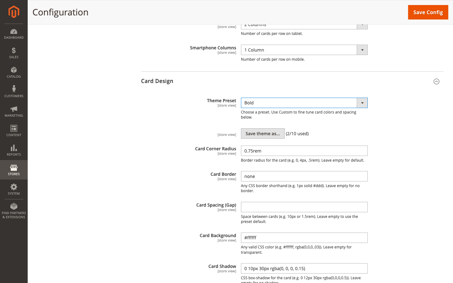
2.3 Card Design
The Card Design section provides extensive customization options for the appearance of each subcategory card.
Theme & Appearance
| Setting | Description | Example Value |
|---|---|---|
| Theme Preset | Choose a predefined style or select Custom | Custom, Modern, Classic, Minimal, Bold, Soft |
| Card Corner Radius | Border radius for rounded corners | 30px, 0, 4px, .5rem |
| Card Border | CSS border shorthand for card borders | 1px solid #ccc |
| Card Spacing (Gap) | Space between cards | 15, 10px, 1.5rem |
| Card Background | Background color for cards | #ffffff, rgba(0,0,0,.03) |
| Card Shadow | CSS box-shadow for cards | 0 3px 4px rgba(0,0,0,0.05) |
| Content Padding New | Padding inside the card content area | 15px, 1rem |
Card Hover Effects
| Setting | Description | Options |
|---|---|---|
| Card Hover Shadow | Shadow intensity applied on hover | None, Light, Medium, Heavy |
| Card Hover Scale | How much the card zooms on hover | None, Subtle (1.02), Medium (1.05), Bold (1.08) |
| Card Hover Background New | Background color when hovering over a card | #f5f5f5, rgba(0,0,0,.02) |
Image Settings
| Setting | Description | Options |
|---|---|---|
| Image Border | Border around the card image | 1px solid #eee |
| Image Corner Radius | Border radius for the image | 8px, 50% |
| Image Aspect Ratio New | Force a specific aspect ratio for images | Auto (Original), 1:1 (Square), 4:3, 16:9 (Widescreen), 3:2 |
| Image Hover Shadow New | Shadow effect on image hover | None, Light, Medium, Strong |
| Image Hover Scale New | Zoom effect on image hover | None, Subtle (1.02), Medium (1.05), Bold (1.08) |
| Image Grow Hover Effect | Enable/disable the grow animation on image hover | Yes / No |
2.4 Card Title Design
Customize how category names appear on each card.
| Setting | Description | Example Value |
|---|---|---|
| Card Title Color | Text color for card titles | #007bff, #333 |
| Card Title Hover Color | Text color when hovering | #0056b3 |
| Card Title Font Size | Font size for titles | 1.6rem, 18px |
| Card Title Font Weight | Font weight for titles | 400, 600, 700 |
| Card Title Alignment New | Text alignment for card titles | Left, Center, Right |
| Card Title Font Stroke New | Text outline/stroke effect for titles | 1px #000000, 2px rgba(0,0,0,0.5) |
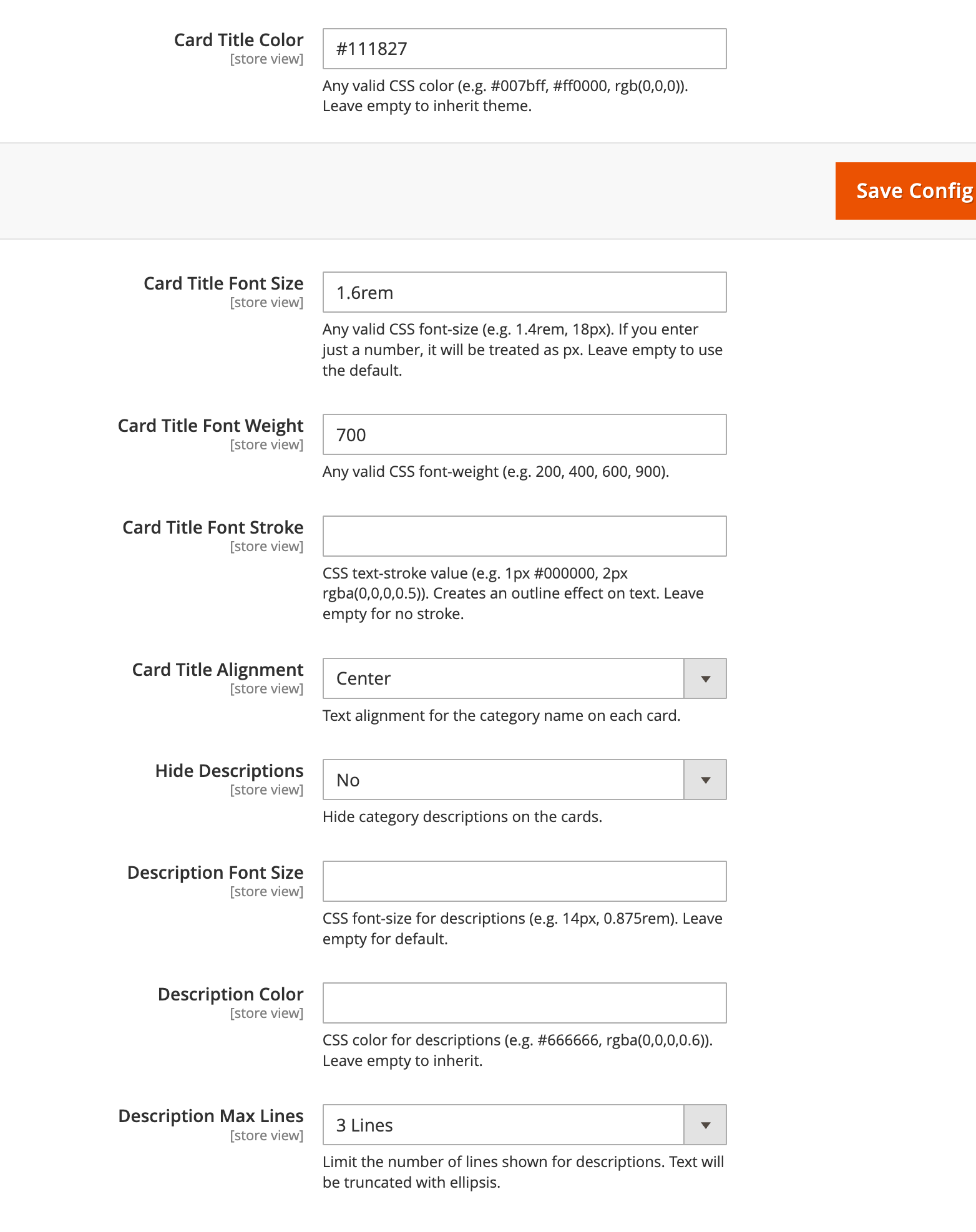
2.5 Description Design New in 2.2.0
Control how category descriptions appear on subcategory cards.
| Setting | Description | Options / Example |
|---|---|---|
| Hide Descriptions | Completely hide category descriptions from cards | Yes / No |
| Description Font Size | Font size for description text | 14px, 0.9rem, 16px |
| Description Color | Text color for descriptions | #666, #888, rgba(0,0,0,0.6) |
| Description Max Lines | Limit the number of lines displayed (uses CSS line-clamp) | Unlimited, 1 Line, 2 Lines, 3 Lines, 4 Lines |
2.6 Theme Presets
Jscriptz Subcats includes several built-in Theme Presets that provide pre-configured styling combinations.
Available Theme Presets
| Preset | Description |
|---|---|
| Custom | No preset applied — manually configure all settings yourself |
| Modern | Clean, contemporary design with subtle shadows and rounded corners |
| Classic | Traditional e-commerce styling with defined borders |
| Minimal | Ultra-clean with minimal visual elements, focus on images |
| Bold | High-contrast design with prominent shadows and hover effects |
| Soft | Gentle styling with light backgrounds and soft shadows |
How to Use Theme Presets
- Navigate to Stores → Configuration → JSCRIPTZ → Jscriptz Subcats
- Expand the Card Design section
- Find the Theme Preset dropdown at the top of the section
- Select your desired preset
- The fields below will update with the preset values
- Click Save Config
- Flush cache:
bin/magento cache:flush
2.7 Custom Theme Presets New in 2.2.0
Version 2.2.0 introduces the ability to save your own custom theme presets for quick reuse across your store.
Saving a Custom Preset
- Configure your desired design settings in the Card Design section
- Scroll to find the "Save Theme As..." button
- Click the button to open the save dialog
- Enter a name for your preset (e.g., "Holiday Theme", "Summer Sale")
- Click Save
- Your preset will appear in the Theme Preset dropdown
Managing Custom Presets
| Action | How To |
|---|---|
| Apply a Preset | Select it from the Theme Preset dropdown and save configuration |
| Delete a Preset | Click the delete icon next to the preset in the dropdown, then confirm |
| View Preset Count | The "Save Theme As..." button shows "(X/10 used)" |
What Gets Saved in a Custom Preset
Each custom preset stores all 25+ design fields including:
- Card styling (radius, border, padding, background, shadow)
- Card hover effects (shadow, scale, background)
- Image styling (border, radius, aspect ratio)
- Image hover effects (shadow, scale)
- Title styling (font size, weight, color, alignment, stroke)
- Description styling (font size, color, max lines, visibility)
- Content padding and transition duration
3. Category-Level Setup
This is where the magic happens. At the category level, you define which subcategories appear, in what order, and how they look. These settings override the global defaults when specified.
3.1 Enable Subcats on a Category
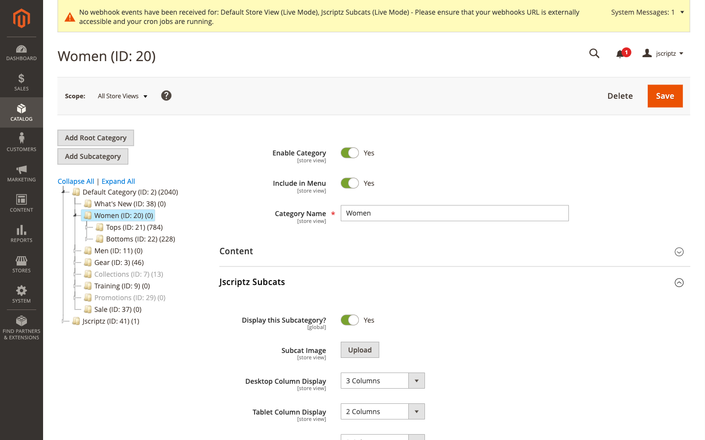
To configure Subcats for a category:
- Go to Catalog → Categories
- Select the parent category where you want subcategory cards to appear (e.g., Women, Men, Gear, Training)
- In the left-side tabs, find and click the Jscriptz Subcats tab
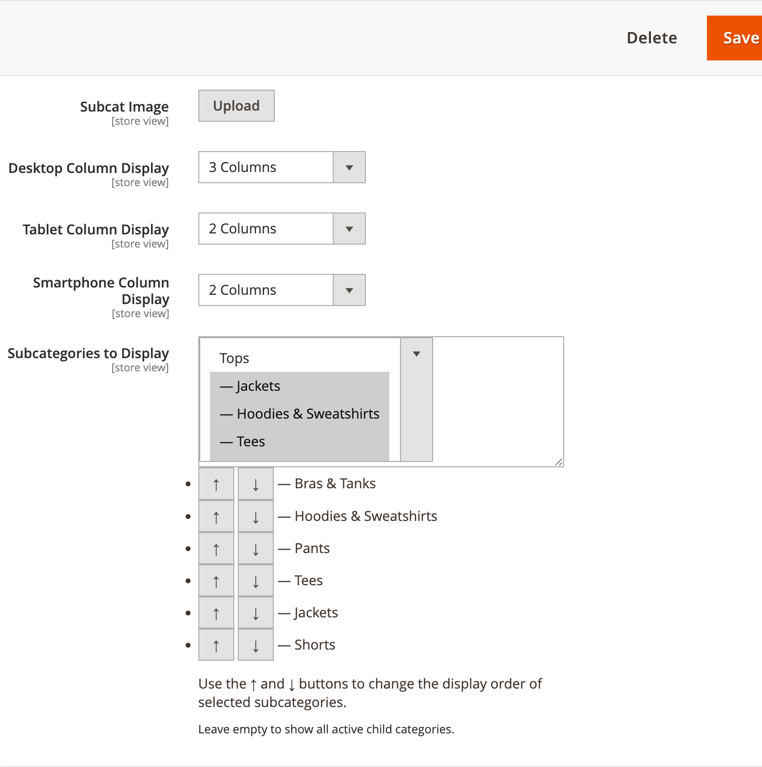
Jscriptz Subcats Tab Fields
| Field | Location | Description |
|---|---|---|
| Display this Subcategory? | Child categories | Controls whether this category appears as a card under its parent. Set to No to hide on the frontend. |
| Subcat Image | Each category | Upload a custom image specifically for the Subcats card display |
| Desktop Column Display | Per-category | Override the global desktop column count |
| Tablet Column Display | Per-category | Override the global tablet column count |
| Smartphone Column Display | Per-category | Override the global mobile column count |
| Subcategories to Display | Parent category | Multi-select to choose which child categories should be shown as cards |
3.2 Upload Subcategory Images
Each subcategory card can have its own dedicated image, providing visual consistency across your store.
- In Catalog → Categories, select the child category (the one that will appear as a card)
- Open the Jscriptz Subcats tab
- Find the Subcat Image field
- Click Upload and select your image
- Save the category
Image Fallback Behavior
The module uses an intelligent fallback system to ensure cards always have images:
| Priority | Image Source |
|---|---|
| 1 (Highest) | Subcat Image — uploaded in the Jscriptz Subcats tab |
| 2 | Category Image — standard Magento category image from the Content tab |
| 3 (Lowest) | Product Image — a product image from within that category (if "Use Product Image Fallback" is enabled) |
3.3 Subcategory Order & Selection
On the parent category, you can precisely control which subcategories appear and in what order.
- Select the parent category (e.g., "Tops")
- Open the Jscriptz Subcats tab
- In the Subcategories to Display field, you'll see a multi-select list of all child categories
- Select the categories you want to show as cards
- Use the ↑ and ↓ arrows to reorder the selected subcategories
- Leave empty to show all active child categories
- Save the category
3.4 Per-Category Column Overrides
You can override the global column settings for specific categories. This is useful when different categories have different numbers of subcategories.
| Field | Options | Description |
|---|---|---|
| Desktop Column Display | 1-6 Columns | Number of cards per row on desktop |
| Tablet Column Display | 1-6 Columns | Number of cards per row on tablets |
| Smartphone Column Display | 1-6 Columns | Number of cards per row on mobile |
4. Using the CMS Widget
Jscriptz Subcats can be rendered on any CMS page or static block using the bundled widget. This gives you complete flexibility to display subcategory cards anywhere on your site — home pages, landing pages, promotional blocks, and more.
4.1 Add Widget to a CMS Page
- Go to Content → Pages
- Edit the page where you want to add subcategory cards (e.g., Home Page)
- In the Content section, click Edit with Page Builder (or access the WYSIWYG editor)
- Position your cursor where you want the widget, or add a new row
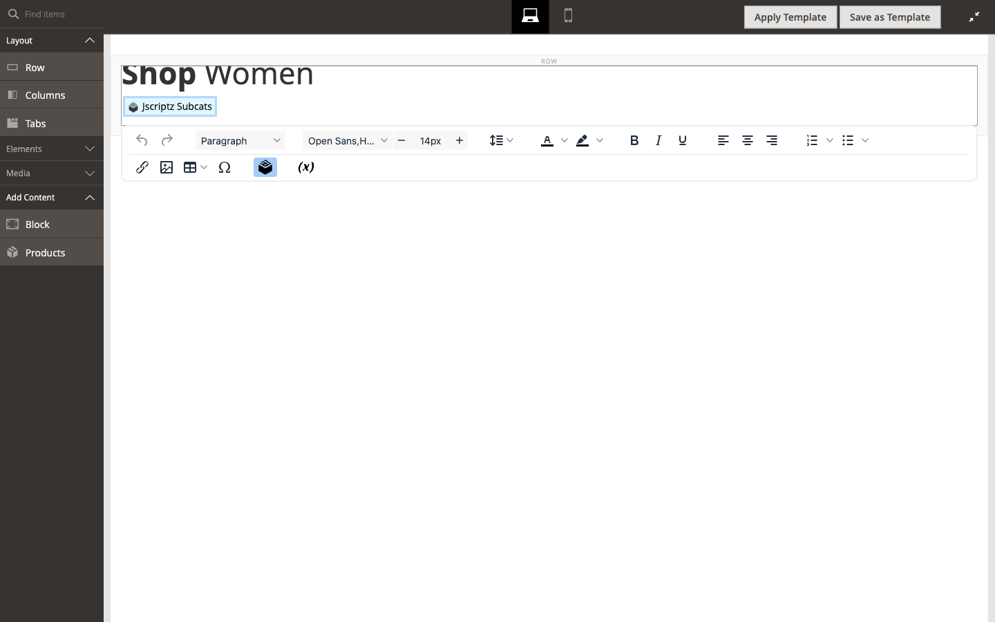
- Click the Insert Widget button (looks like a cookie/chip icon in the toolbar)
- In the Insert Widget dialog, select Widget Type: Jscriptz Subcats
- Configure the Widget Options (see next section)
- Click Insert Widget
- Save the page
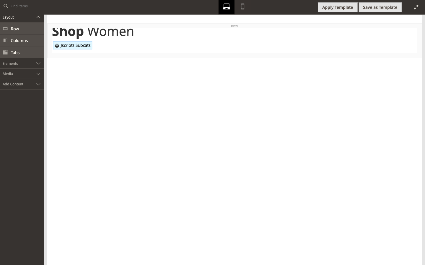
Page Builder interface with the editing toolbar
Click the "Insert Widget" button (cookie icon) in the toolbar to add a widget
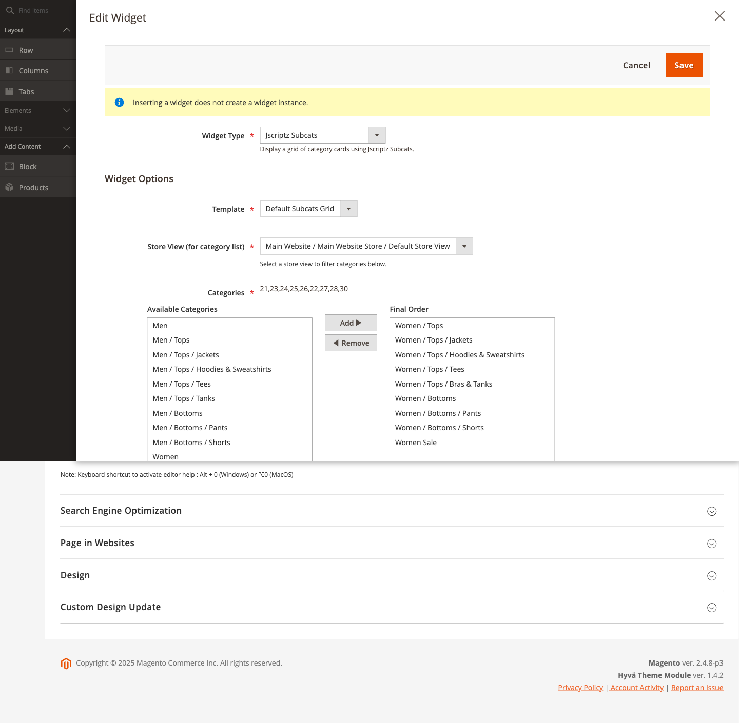
The Edit Widget dialog with Jscriptz Subcats selected showing all configuration options
4.2 Widget Options Explained
When inserting a Jscriptz Subcats widget, you have extensive configuration options:
Basic Options
| Option | Description |
|---|---|
| Template | Choose the display template: Subcats Grid (default) or Subcats Slider New |
| Store View Filter | Select store view to filter category lists |
| Theme Preset | Override the global theme preset for this widget instance |
Category Selection
| Option | Description |
|---|---|
| Available Categories | List of all categories in your store |
| Final Order | Categories selected to display, in display order |
| Add / Remove | Move selected categories between lists |
| Move Up / Move Down | Reorder categories within Final Order |
Display Options
| Option | Description |
|---|---|
| Columns (Desktop) | Override global desktop column count, or "Use Global / Category Setting" |
| Columns (Tablet) | Override global tablet column count |
| Columns (Mobile) | Override global mobile column count |
| Show Title | Display a title/heading above the cards |
| Hide Empty Categories New | Hide categories with no products |
| Show Product Count New | Display product count badge on cards |
| Open Links In New | Same Window or New Tab |
Title Styling Options
| Option | Description | Example |
|---|---|---|
| Title | The heading text | "Men", "Shop Our Collection" |
| Title Font Size | CSS font-size value | 48px, 2rem |
| Title Font Weight | CSS font-weight value | 700, 400 |
| Title Alignment | Left, Center, or Right | Left |
| Title Color | CSS color value | #444, blue |
| Title Margin | CSS margin value | 0 0 1.5rem 0 |
| Title Padding | CSS padding value | 0.5rem 0 |
Card Title & Description Options New
| Option | Description |
|---|---|
| Card Title Font Size | Size for individual card titles |
| Card Title Font Weight | Weight for card titles |
| Card Title Font Stroke | Text outline effect |
| Card Title Color | Color for card titles |
| Card Title Hover Color | Color when hovering on card titles |
| Card Title Alignment | Left, Center, Right, or Use Global Setting |
| Hide Descriptions | Toggle visibility of category descriptions |
| Description Font Size | CSS font size for descriptions |
| Description Color | CSS color for descriptions |
| Description Max Lines | Limit lines (Unlimited, 1, 2, 3, or 4) |
Card & Image Design Options New
All card design options from the global configuration are also available at the widget level:
- Image Aspect Ratio
- Image Corner Radius, Border
- Image Hover Shadow & Scale
- Card Corner Radius, Border, Padding, Background, Shadow
- Card Hover Shadow, Scale, Background
- Content Padding
- Design Preset override
4.3 Slider Template New in 2.2.0
Version 2.2.0 introduces a Slider Template option that displays your subcategory cards in a horizontal carousel format instead of a static grid.
Enabling the Slider
- When configuring the widget, find the Template dropdown in Main Settings
- Select Subcats Slider instead of "Subcats Grid"
- The Slider Settings section will appear with additional options
- Configure slider behavior as needed
- Save the widget
Slider Settings
| Setting | Description | Default |
|---|---|---|
| Show Navigation Arrows | Display previous/next arrow buttons on the slider | Yes |
| Show Pagination Dots | Display dot indicators below the slider for page navigation | Yes |
| Autoplay | Automatically advance slides at a set interval | No |
| Autoplay Interval (ms) | Time between automatic slide transitions in milliseconds | 5000 (5 seconds) |
| Infinite Loop | Loop back to the beginning after reaching the last slide | Yes |
| Transition Effect | Animation style when transitioning between slides | Slide |
| Transition Speed (ms) | Duration of the slide transition animation | 300 |
| Gap Between Slides | CSS value for spacing between slide items (e.g., 20px, 1rem) | 20px |
Responsive Slides Per View
Control how many category cards are visible at once on different screen sizes:
| Setting | Description | Options | Default |
|---|---|---|---|
| Slides Per View (Desktop) | Number of visible slides on desktop screens (1024px+) | 1, 2, 3, 4, 5, 6 | 4 |
| Slides Per View (Tablet) | Number of visible slides on tablet screens (768px - 1023px) | 1, 2, 3, 4 | 2 |
| Slides Per View (Mobile) | Number of visible slides on mobile screens (< 768px) | 1, 2 | 1 |
Slider Behavior
- Navigation Arrows: Previous/Next buttons appear on the left and right sides of the slider. They are automatically disabled at the start/end when loop is off.
- Pagination Dots: Clickable dots below the slider indicate the current page and allow direct navigation.
- Touch/Swipe: On mobile devices, users can swipe left/right to navigate between slides.
- Autoplay Pause: When a user hovers over the slider (desktop) or touches it (mobile), autoplay automatically pauses to prevent disruption.
- Keyboard Navigation: Arrow keys can be used to navigate when the slider is focused.
4.4 Use in a CMS Block
You can also add Jscriptz Subcats to a reusable CMS Block, which can then be placed in multiple locations.
- Go to Content → Blocks
- Click Add New Block or edit an existing block
- Give the block a meaningful Title and Identifier (e.g., "Jscriptz Subcats Block")
- In the Content area, click Edit with Page Builder or use the WYSIWYG
- Insert the Jscriptz Subcats widget using the same process as CMS pages
- Save the block
4.5 Add CMS Block to Category
You can display your Jscriptz Subcats CMS Block directly on a category page using the Add CMS Block feature.
- Go to Catalog → Categories
- Select the category where you want to display the block
- Scroll down to find the Content section
- Find the Add CMS Block dropdown
- Select your Jscriptz Subcats Block
- Save the category
Benefits of this approach:
- Create one reusable block with your widget configuration
- Apply it to multiple categories
- Update the block once, and all categories reflect the change
5. Creating a Standalone Widget
In addition to inserting widgets into CMS pages and blocks, you can create standalone Widget Instances that can be assigned to specific layout containers and pages.
- Go to Content → Widgets
- Click Add Widget
- In the Settings panel:
- Type: Select Jscriptz Subcats
- Design Theme: Select your active theme
- Click Continue
- Configure Storefront Properties (Widget Title, Store Views, Sort Order)
- Configure Layout Updates to specify where the widget appears
- Configure Widget Options (same as when inserting via Page Builder)
- Click Save
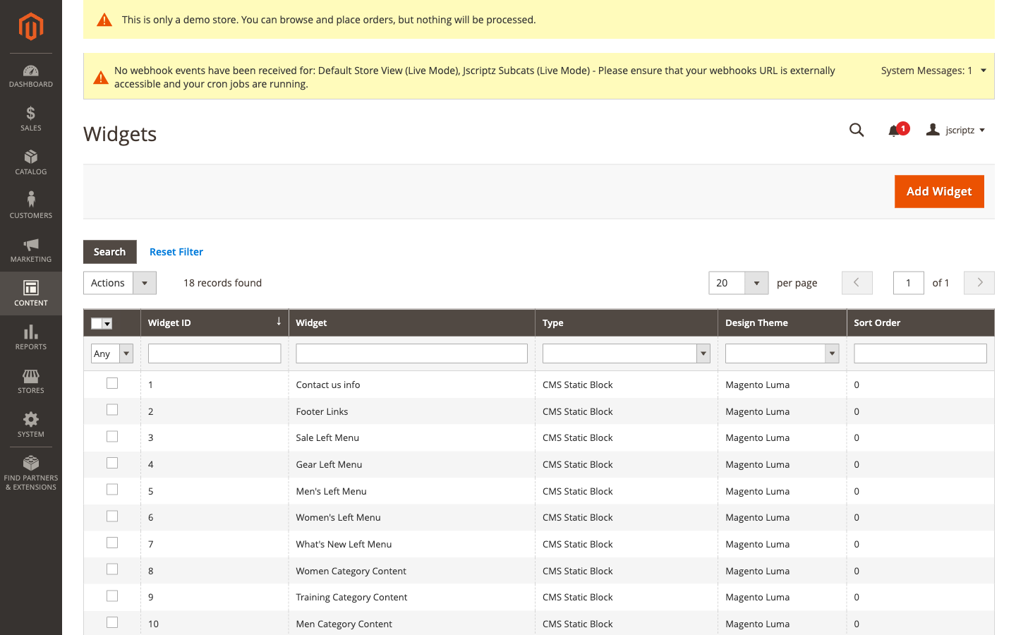
The Content > Widgets page listing all widget instances
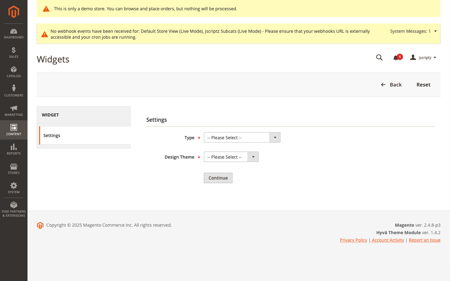
Step 1: Select "Jscriptz Subcats" as Type and choose your Design Theme, then click Continue
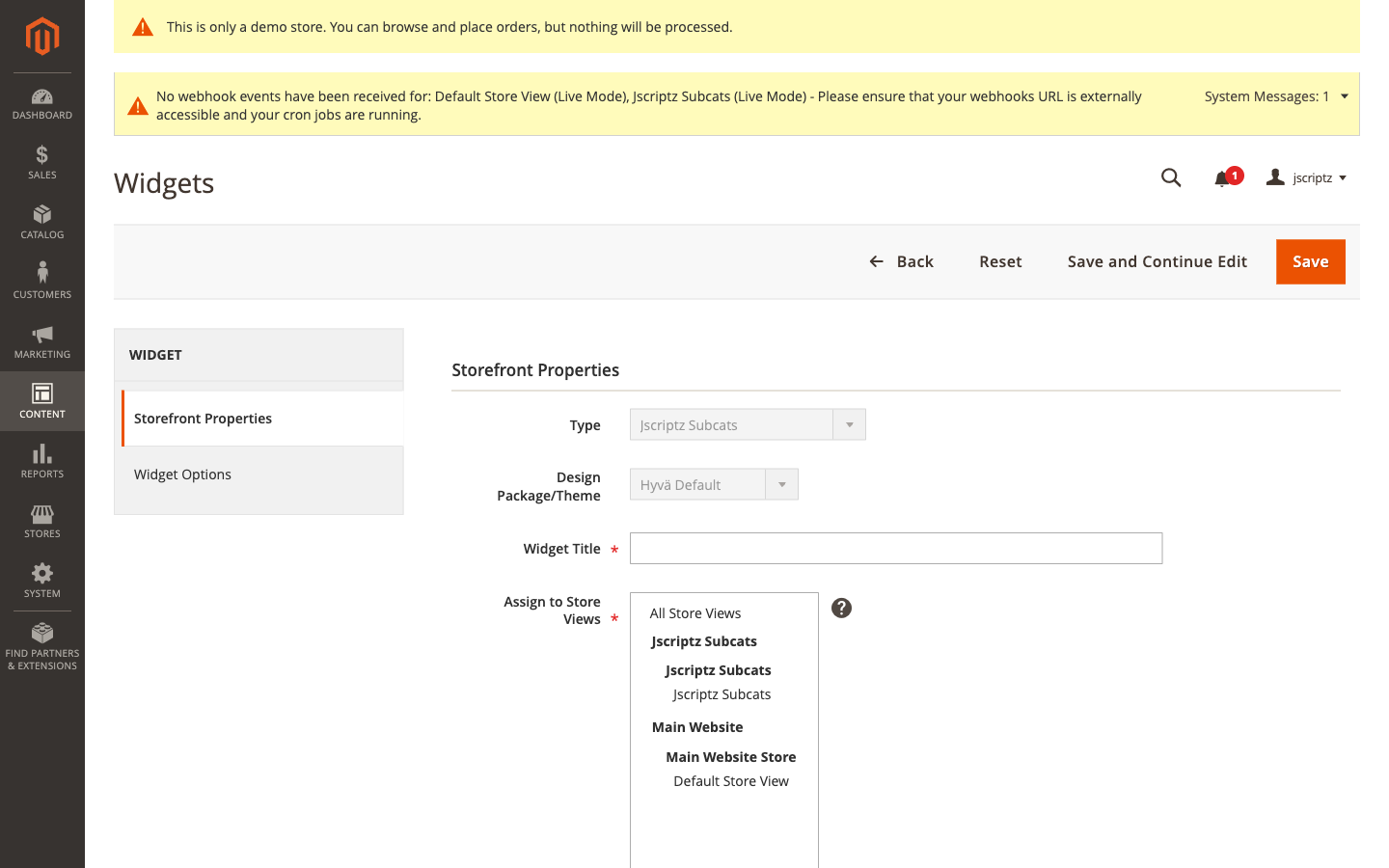
Storefront Properties: Configure Widget Title, Store Views, Sort Order, and Layout Updates
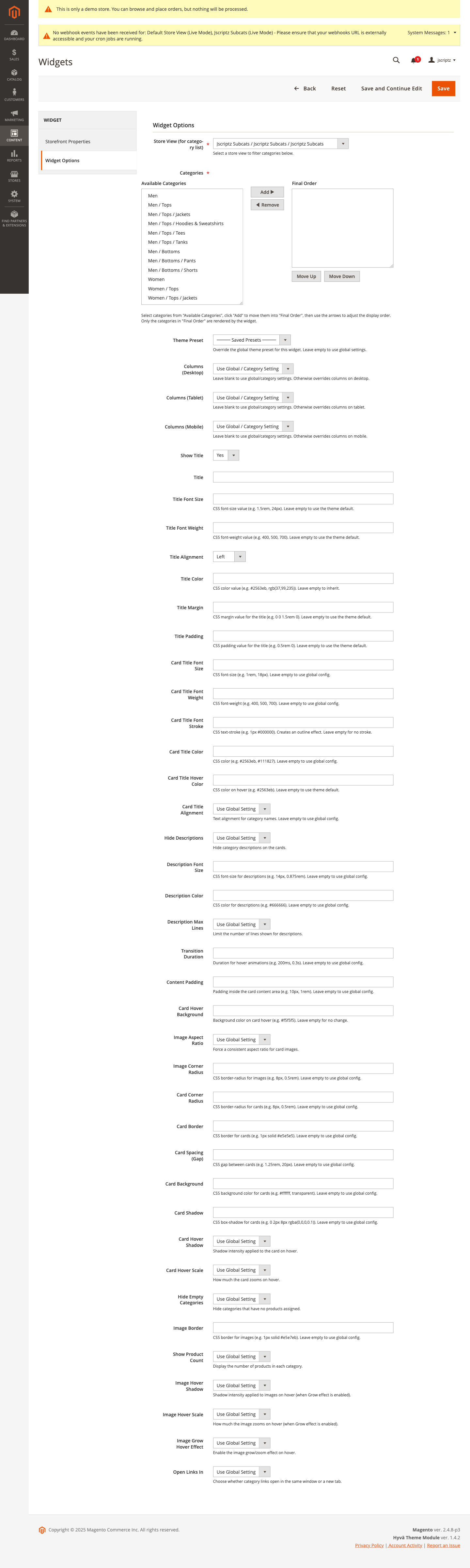
Widget Options: Configure categories, theme preset, columns, titles, and design settings
6. Image & Layout Behavior
6.1 Card Structure
Each subcategory card typically displays:
- Category Image — The visual centerpiece of the card
- Category Name — The title/label for the subcategory
- Product Count Badge — Optional count of products (if enabled)
- Optional Description — Controlled by description design settings
- Hover Effects — Shadows and scale effects on interaction
6.2 Image Fallback Chain
Jscriptz Subcats uses an intelligent image fallback system:
- Subcat Image — Custom image uploaded in the Jscriptz Subcats tab (highest priority)
- Category Image — Standard Magento category image from the Content tab
- Product Image — A product image from within that category (if enabled in global settings)
6.3 Image Aspect Ratio New in 2.2.0
Control how images are displayed using the Image Aspect Ratio setting:
| Option | Description | Use Case |
|---|---|---|
| Auto (Original) | Preserves original image dimensions | When all images have consistent sizes |
| 1:1 (Square) | Forces square aspect ratio | Modern, Instagram-style layouts |
| 4:3 | Traditional photo ratio | Classic product photography |
| 16:9 (Widescreen) | Wide cinematic ratio | Banner-style category displays |
| 3:2 | Standard photo ratio | Professional photography layouts |
6.4 Responsive Columns
The column system adapts to different screen sizes:
| Breakpoint | Typical Width | Default Columns |
|---|---|---|
| Desktop | 1024px+ | 4 columns |
| Tablet | 768px - 1023px | 2-3 columns |
| Mobile | < 768px | 1-2 columns |
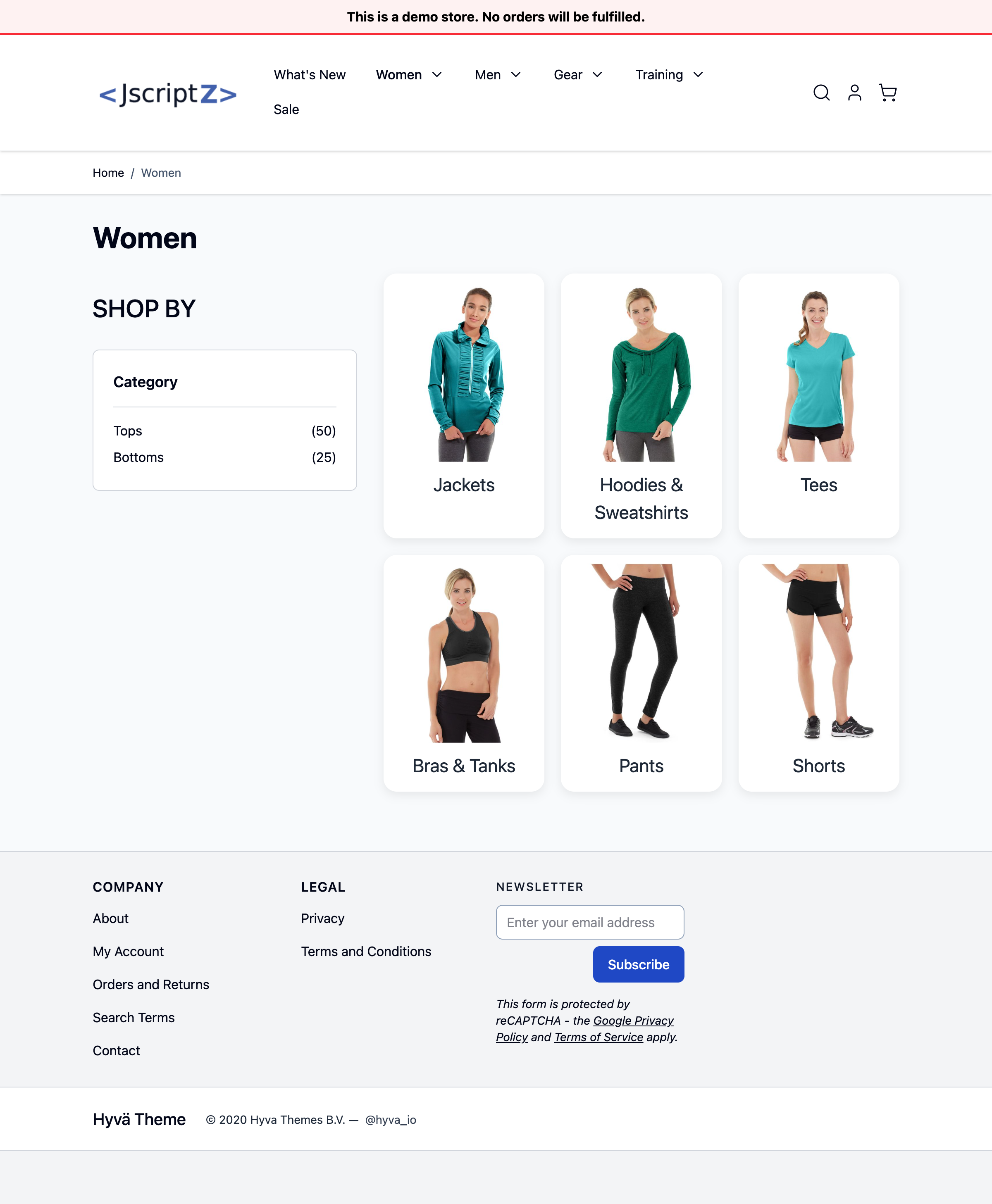
7. Frontend Card Layout
7.1 Grid Display
The standard grid layout displays subcategory cards in a responsive row/column format.
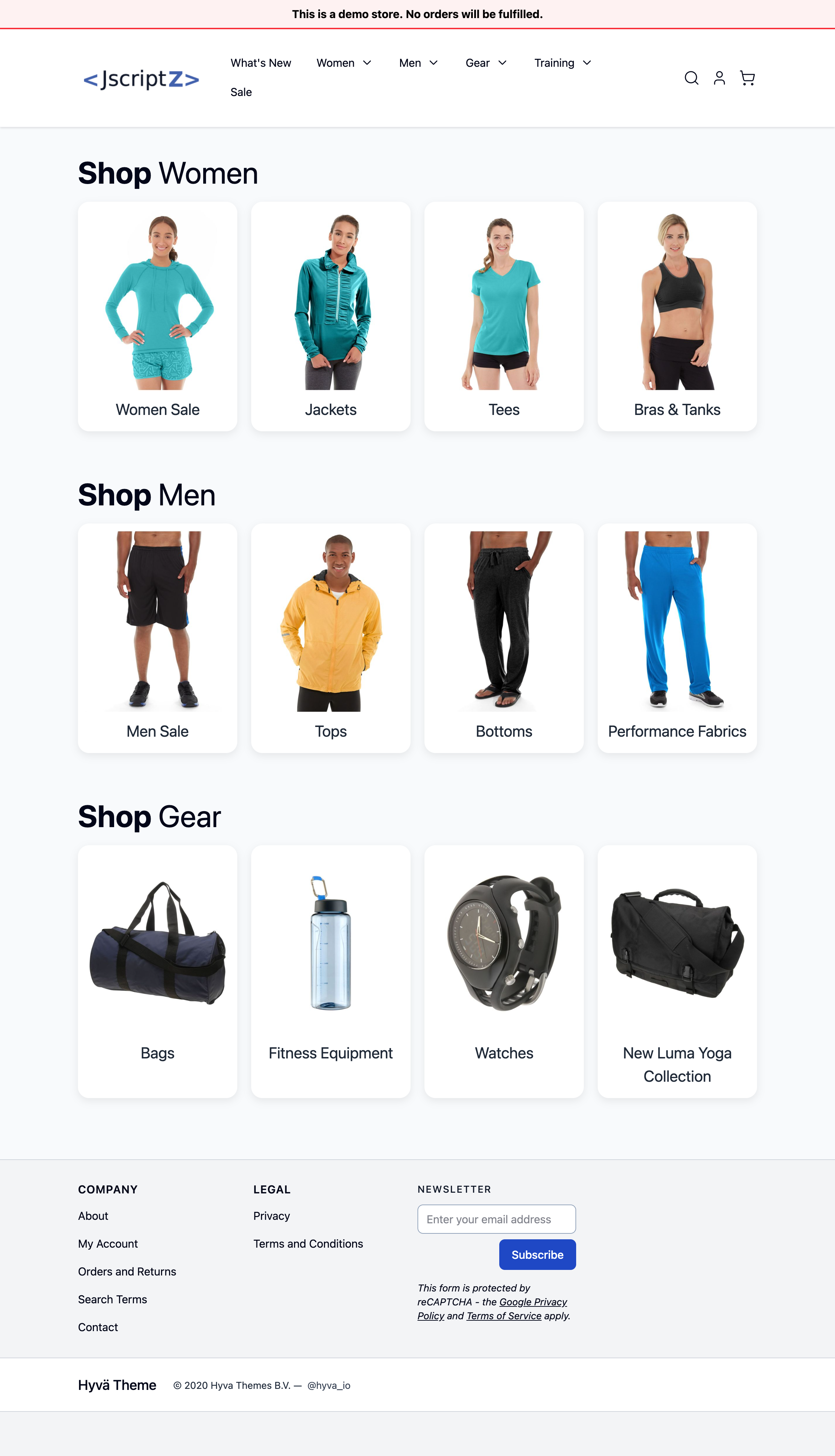
Each card includes:
- A prominent image
- The category name below
- Optional product count badge
- Optional description (respecting max lines setting)
- Smooth hover transitions (if enabled)
- A clickable area that links to the subcategory page
7.2 Category Page Integration
When configured on a category, the subcategory cards appear above the product listing, providing intuitive navigation for customers to drill down into specific product types.
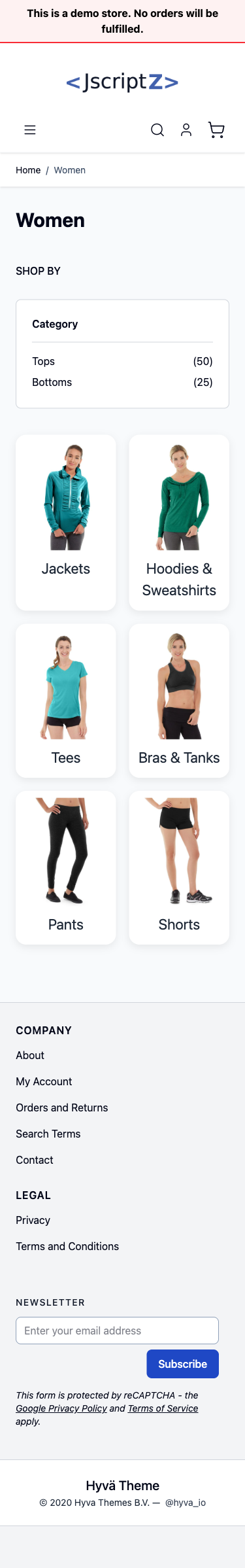
7.3 Mobile Responsive View
On smaller screens, the layout automatically adjusts:
- Cards stack appropriately for the screen width
- Touch-friendly sizing
- Readable text and imagery
- Good Largest Contentful Paint (LCP) scores for Core Web Vitals
8. Hyvä Theme Compatibility
Jscriptz Subcats is fully compatible with Hyvä Themes, the modern AlpineJS/Tailwind CSS-based Magento theme.
8.1 Theme Detection
The module includes intelligent theme detection that automatically:
- Detects when Hyvä is active
- Loads the appropriate templates and styling
- Uses Tailwind CSS utilities when appropriate
8.2 Hyvä-Specific Configuration
When using Hyvä, the module respects Hyvä's architecture by:
- Using AlpineJS for interactivity
- Leveraging Tailwind CSS for styling
- Maintaining compatibility with Hyvä's performance optimizations
8.3 Live Demo
Visit https://hyva.jscriptz.com to see Jscriptz Subcats running on a Hyvä theme installation.
9. Troubleshooting
9.1 No Subcategories Showing
Check the following on the parent category:
- Is the Jscriptz Subcats module Enabled globally? (Stores → Configuration → JSCRIPTZ → Jscriptz Subcats → General Settings → Enabled = Yes)
- Have you selected any subcategories in Subcategories to Display? If left empty, all active children should show.
Check the child categories:
- Is Display this Subcategory? set to Yes (or not explicitly set to No)?
- Is the child category Enabled and assigned to the correct Store View?
- If Hide Empty Categories is enabled, does the category have products?
After making changes:
bin/magento indexer:reindex
bin/magento cache:flush
9.2 Widget Appears But No Styling
If you see basic HTML with no card styling:
- Verify CSS is loading: Check that your theme is including Jscriptz Subcats CSS
- Deploy static content:
bin/magento setup:static-content:deploy -f - For Hyvä themes: Ensure the Hyvä-specific layout XML is active
- Clear all caches:
bin/magento cache:flush
9.3 Images Not Displaying
- Check image upload: Verify the Subcat Image is uploaded in the category's Jscriptz Subcats tab, or ensure the standard Category Image is set
- Check fallback settings: If relying on product image fallback, ensure Use Product Image Fallback is enabled globally
- Check file permissions: Ensure
pub/media/catalog/category/is writable
9.4 Custom Presets Not Saving
- Check preset limit: You can only save 10 presets per store view
- Check permissions: Ensure your admin user has the
Jscriptz_Subcats::preset_manageACL permission - Check JavaScript console: Look for any JavaScript errors in the browser console
- Verify database: Check that the
jscriptz_subcats_custom_presettable exists
Quick Reference: Configuration Hierarchy
Understanding the configuration override cascade helps troubleshoot unexpected behavior:
Widget Settings (highest priority)
       ↓
Category Settings
       ↓
Global Configuration (lowest priority)
For example, if you set Desktop Columns to 4 globally, but a specific widget sets Desktop Columns to 3, that widget will display 3 columns.
Support
For additional help or to report issues:
| Resource | URL |
|---|---|
| Documentation & Updates | mage.jscriptz.com/jscriptz-subcats-user-guide |
| Live Demo | hyva.jscriptz.com |